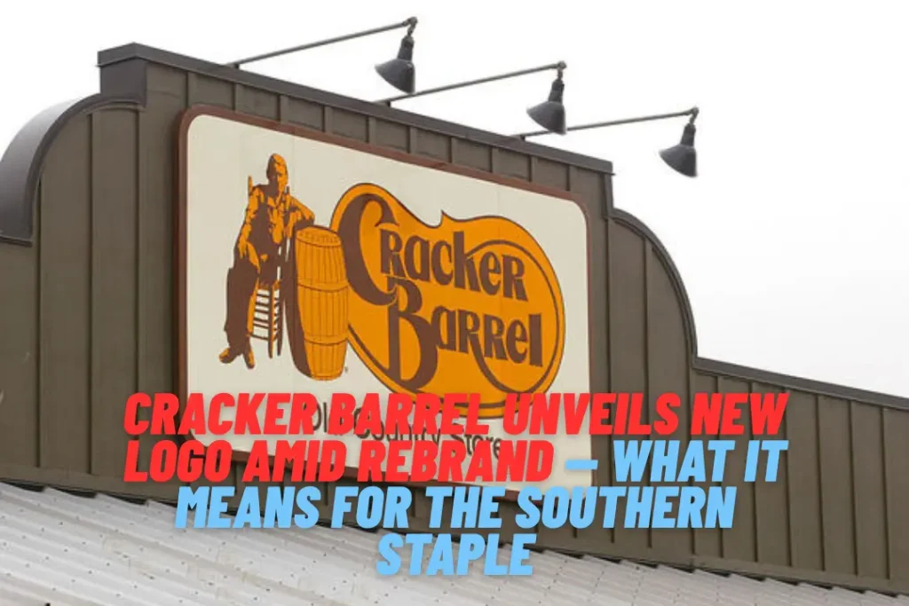
Cracker Barrel Unveils New Logo Amid Rebrand — What It Means for the Southern Staple

Cracker Barrel, the beloved Old Country Store chain known for its Southern charm and iconic rocking chairs, just introduced a major rebrand in 2025—starting with a bold new logo. For the first time in nearly 50 years, the familiar image of the man leaning on a barrel has vanished, replaced by a sleek, text-only design. The refreshed logo comes as part of the “All the More” campaign, which includes menu updates, store remodels, and a new marketing push.
Below is a full breakdown of why this change matters, how fans are reacting, and what it signals for the future of Cracker Barrel.
What’s Behind the New Logo?
Cracker Barrel’s new logo is a text-only redesign, ditching its decades-old man-with-barrel emblem.
- Dropped motif: No more silhouette of the elderly gentleman slumped against a barrel since 1977.
- Modern typography: Clean, streamlined type that feels contemporary yet familiar.
- Signature tones retained: Gold and brown remain central, with new accent colours like red, sky blue, and grassy green.(People.com, Country Living)
- Back to roots: The redesign echoes their original 1969 style but with modern polish.(People.com, Country Living, logohistory.net – logohistory.net)
Cracker Barrel Chief Marketing Officer Sarah Moore explained, “Our story hasn’t changed… honouring our legacy while bringing fresh energy, thoughtful craftsmanship and heartfelt hospitality.”(Country Living, People.com)
What Else Is Changing: Menu & Store Design
The logo is just one element of a broader transformation.
- “All the More” Campaign: Includes revamped logo, fresh menu items, remodelled interiors, and new advertising.(Country Living, People.com)
- New menu highlights:
- Hashbrown Casserole Shepherd’s Pie
- Cinnamon Roll Skillet
- Butter Pecan French Toast Bake
- Herb-Roasted Chicken & Classic Pot Roast
- Fan-favourite Uncle Herschel’s Favourite breakfast is back(Country Living, People.com, Yahoo)
- Store redesigns:
- Lighter, “modern farmhouse” interiors with curated antiques
- Replaced dark, cluttered décor for a brighter, airy feel(People.com, Tasting Table, ABC News)
- Promotional highlights:
- Country singer Jordan Davis stars in ads and live events
- Free classic side with any purchase on August 23–24(Country Living, New York Post)
Fan Reaction: Mixed Emotions (and a Dash of Politics)
Public reaction to the new logo has been vocal—and polarised.
- Conservative backlash: Some right-wing figures criticised the removal of the “classic barrel man.”
- Donald Trump Jr.: “WTF is wrong with Cracker Barrel?”
- Senator Mike Lee compared it to Land O Lakes’ logo change.
- Online conservative voices accused CEO Julie Felss Masino of abandoning tradition. (The Daily Beast)
- Nostalgia fatigue: Many longtime diners lament the loss of rustic charm, equating the new look to an IHOP-like feel. (Business Insider, Tasting Table, ABC News)
- Defenders of progress: Others welcome the updated branding, seeing it as an essential refresh to stay relevant. (People.com, Country Living)
The Bigger Picture: Why Rebrand Now?
Cracker Barrel’s leadership believes modernisation is essential to remain relevant.
- CEO’s stance: Julie Felss Masino acknowledged that the brand “wasn’t as relevant” and needed a refresh. (The Daily Beast, Northeastern Global News)
- Marketing perspective: Experts caution that brands must refresh, not replace, to maintain identity. (Northeastern Global News)
- Rollout numbers: About 40 of 660 locations have been remodelled so far, with more to follow. (People.com, Business Insider)
A Brief History of the Cracker Barrel Logo
To understand the significance of the change, let’s look back:
- 1969 – 1977: Text-only “Old Country Store” style evoking saloon aesthetics. (logohistory.net – logohistory.net)
- 1977 – 2006: Introduction of the man leaning on a barrel, classic yellow banner with brown text. (logohistory.net – logohistory.net, Daily Meal)
- 2006 – 2015: Refreshed colours and cleaner graphics. (logohistory.net – logohistory.net)
- 2015 – 2025: Simplified, flatter banner with updated typeface. (logohistory.net – logohistory.net)
- 2025: Return to text-only logo with contemporary touches. (People.com, Country Living, logohistory.net – logohistory.net)
What the New Logo Means for the Brand and Guests
Pros:
- Modern and streamlined aesthetic
- Consistent branding across menus, packaging, and digital channels
- Fresh appeal for younger diners and travellers
Cons:
- Loss of iconic imagery that many associate with the brand’s identity
- Criticism that it dilutes the nostalgic atmosphere
- Risk of alienating loyal customers who equate Cracker Barrel with tradition
Brand intent:
- Emphasises continuity: “Our values haven’t changed.”(Country Living, The Daily Beast)
Final Verdict: Cracker Barrel’s Next Chapter
Cracker Barrel’s redesign marks a thoughtful transformation—not a renouncement of its roots. The updated logo, menus, and interiors reflect a desire for modern relevance while holding onto elements like Peg Games, buttermilk biscuits, and rocking chairs.
Time will reveal whether this balance will resonate with loyal fans and new diners alike—or whether nostalgia proves stronger than progress.


